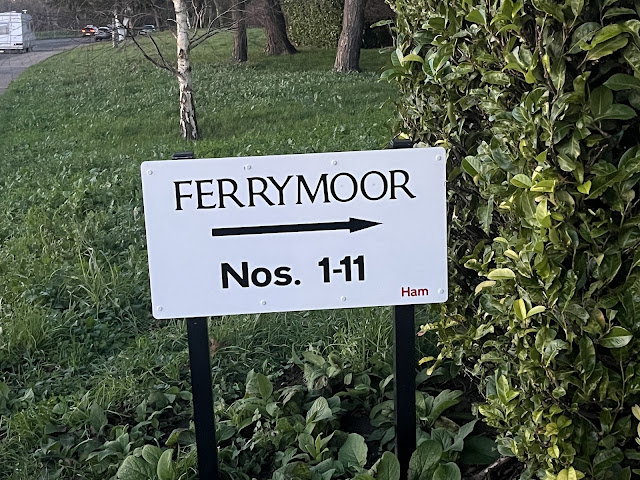
I thought that I had finished with street wigns in 2023 then I thought about this one and now I have more to say on the subject. The obvious problem here is that the lower, and less important text, is bold whereas the street name is not.
I also think that it would look better with the arrow below the house numbers, as it looks more attached to the street name placed where it is.

No comments:
Post a Comment
All comments are welcome. Comments are moderated only to keep out the spammers and all valid comments are published, even if I disagree with them.